A few days ago, Michael Blastland published a very interesting little article on the BBC Magazine website, in which he showed an image of Parallel Sets. He also mentioned my name and even though there was no link or email address, I have seen a spike in traffic on this website and my university page, and have gotten a barrage of emails from people who want to try it out. Here is some information on the technique and a plan for getting the tool out into the world.
The article itself is concerned with the representation of risk, and is really interesting. Parallel Sets only make an appearance further down, as a possible alternative way of representing risk. What is interesting for me is that the image Blastland uses is taken from my entry in the Design, Vision, and Visualization workshop at Vis 2008. I did a redesign of the original ParSets for that, and did not really consider them published. Oh well.
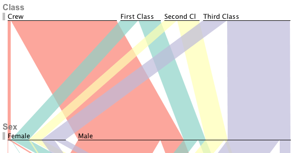
Parallel Sets is a technique for visualizing categorical data. The main idea was to get away from representing individual data points, and instead show sets and subsets of items with certain combinations of criteria. This works very well for data like customer surveys, census data, and many other kinds of purely categorical or mixed categorical and continuous data - like my standard example, the people on board the Titanic (see above). In a way, ParSets is a mix between parallel coordinates and treemaps/mosaic plots.
The technique was developed a few years ago by my student Fabian Bendix, myself, and Helwig Hauser. We published a paper at InfoVis 2005, an expanded version of which appeared in TVCG, Parallel Sets: Interactive Exploration and Visual Analysis of Categorical Data.
I have done some further work on the technique as well as worked on a new implementation. Currently, I am working with a colleague and a student in bioinformatics on using ParSets (and other techniques) as a new way of looking at genomic data.
So what about getting access to the program right now? I have been planning on releasing the program for a long time (and I completely agree with Iain Cunningham who recently called me out on my statements elsewhere that we should be forced to publish our code). Unfortunately, the current implementation is a typical academic prototype: buggy, unfinished, and the code is really horrible in places.
We have recently started a new implementation based on a new data model that embodies a lot of what we have learned about the technique and the data we are looking at. There are also new interactions that will make working with Parallel Sets more efficient, and the new design (some of which you see above) brings out the represented data in a much clearer way than before.
When will you be able to use the program for your own data? At the end of April. We are going to release the software as open source by then. If you want to be notified, leave a comment here or send me a message through the contact form. I will certainly brag about it here once it's out, and also post some more about the actual technique, how to use it, etc.
I really appreciate the interest we have received for the technique in the last few days, and I am sure that you will be even more excited once you see it in action, with your own data. In the meantime, please bear with us - you won't be disappointed.
Comments (8)
Posting new comments was disabled in 2020.