
The New York Times uses some of the best information graphics and visualizations on its web site and in the printed paper. But there is also a strange undercurrent of bad graphics, many of which commissioned from other sources, and often published in the New York Times Magazine. It almost feels like between all the good graphs, they need an outlet for the crazy stuff.
The NYTimes folks do not only know what's going on in information visualization: Matthew Ericson, thir Deputy Graphics Director, gave the keynote at InfoVis 2007. He talked about their attempts to adapt visualization techniques for use with a general audience and how they add hints for people to understand what is being shown.
They know how to use treemaps, and recently used one to show how the financial sector in the US has shrunk by 50% over the last year. And while this is a good visualization, their use of animation to provide transitions between the two points in time is very confusing. It is nearly impossible to follow what is going on. It takes me several seconds after each transition to find a particular institution again. This is how animation should not be done, and there is work out there that shows how to do this the right way.
I came across two other graphs in the NYTimes Magazine recently that also had me scratch my head. Looking through the graphs published this year, I found a few really good ones (including a good use of a 3D "brick"/"square pie" chart), a number of so-so ones, and a few really bad ones. These are clearly among the latter.
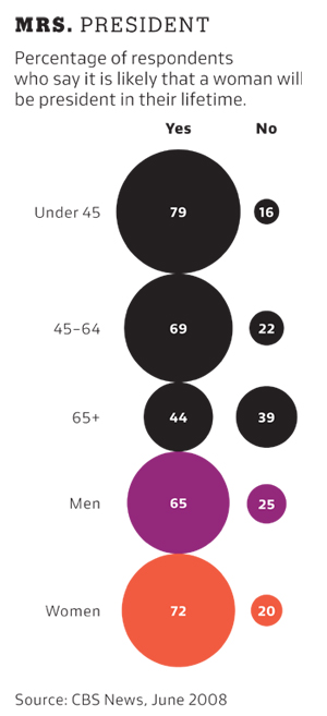
Exhibit A is from September 14, and looks at expectations of people to see a woman as President of the United States. These bubbles are very hard to compare, but what is more, they scaled the radius rather than the area. As we discussed recently, that has a quadratic effect on the area, exaggerating large numbers.
A bar chart may be boring (and also the usual response to a bad chart), but in this case a stacked bar chart would have made a lot more sense. Or even a number of (square) pie charts. Anything but this.
JunkCharts also recently discussed another bubble chart from the NYTimes, which has the opposite problem: All bubbles are (almost) the same size, even if the numbers are quite different. After these extremes, there's hope that there will be more correct bubble charts in the future, or even other kinds of charts that are easier to read to begin with, even without distortions.
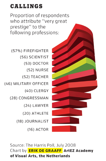
Exhibit B is from September 21, and is an example of the ever popular pie chart, and perhaps the worst pie chart I have seen so far (and I've seen a few). Not only do the numbers not add up to 100%, the pseudo-3D makes the slices even harder to read than usual. The only thing the chart tells us is that there are different numbers of people who find that each of these professions prestigious. But a simple list would have accomplished the same thing. Making things more interesting is a good idea, but distorting the graph to the point of it being unreadable is not a price we should have to pay for that.
With great power comes great responsibility. The NYTimes is breaking new ground with their use of visualization and interaction, and I am grateful that they are really paying attention to what is happening in information visualization. But I wish they could reign in the their Department of Silly Charts and integrate it with the rest of the paper.